Design guide
The anatomy of a premium digital restaurant menu
A premium digital menu is neither a PDF hidden behind a QR code nor a gallery of polished food pictures. It organizes a guest’s decision on a small screen, makes dishes understandable and carries the restaurant’s identity without getting in the way of service.
A premium digital menu is a mobile-first path through the restaurant’s offer: clear categories, precise dish information, intentional imagery and restrained interactions that keep the food—not the interface—at the centre.
Book a call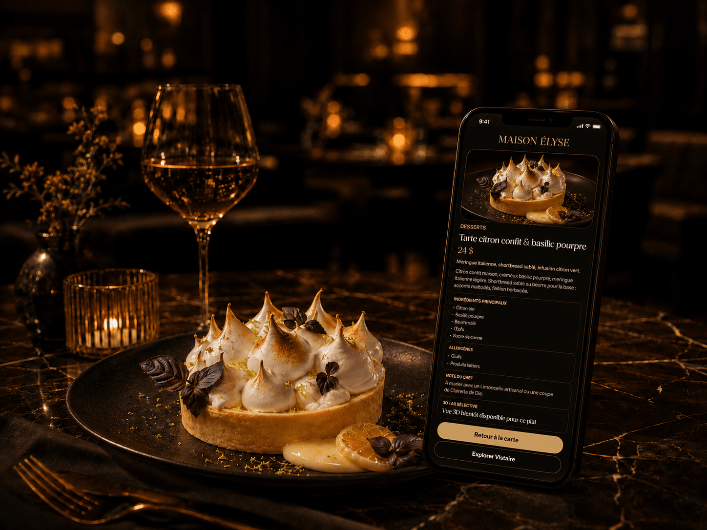
01
Hierarchy should answer before it tries to impress
The menu’s first job is orientation. A guest should know which category is active, what other parts of the menu are available and how to return after opening a dish. A refined visual treatment cannot repair ambiguous navigation. On a phone, concise labels and a predictable order reduce avoidable searching.
Category order also expresses the rhythm of the meal. It may follow the sequence of service or a structure unique to the restaurant. That decision should be editorial rather than generated by a database. The most important choices need familiar guest-facing language, not internal kitchen terminology.
- A visibly active category.
- Names that match the language used by the dining-room team.
- A clear return from a dish to its place in the menu.
- A shallow path from category to list to dish detail.
02
A dish page turns a line item into an informed choice
The dish name opens the promise; the description provides the clues needed to choose. Strong copy identifies the defining ingredients, preparation or sensory character without reproducing the full recipe. It avoids generic praise and favours details a guest can understand: a cooking method, a known origin, a condiment or a texture.
Price belongs beside the name, not behind another interaction. Formats, additions and supplements should be clear before ordering. House signatures can carry a restrained badge when that badge has a consistent meaning throughout the menu rather than acting as decoration.
| Element | Guest question | Useful editorial answer |
|---|---|---|
| Name | What is it? | A distinctive, readable and stable title. |
| Description | What defines it? | A few concrete cues in the restaurant’s voice. |
| Price | What is the actual choice? | A visible amount with formats and extras explained. |
| Badge | Why should I notice it? | Useful meaning such as signature, plant-based or recommended. |
03
Photography should support appetite without standardizing the food
A dish photograph earns its place when it clarifies portion, composition or a presentation that words cannot easily convey. It should represent what arrives at the table. Excessive retouching and stock imagery create a trust gap, even when the result looks dramatic.
Consistency matters more than volume. Light, framing, background and colour temperature can form a common grammar while dishes keep their character. An incomplete but honest photo set is preferable to generic placeholders that imply something the kitchen does not serve.
04
Allergens, dietary preferences and badges need careful language
Allergen and dietary information should be easy to find, consistently worded and connected to a real kitchen process. An interface cannot infer cross-contact conditions or replace a conversation with staff. The menu should distinguish declared ingredient information from assurances the restaurant is not equipped to make.
A small badge vocabulary is easier to understand. Vegetarian, vegan, spicy or signature markers can speed up reading when kitchen and service teams share their definitions. Text labels and an accessible legend communicate more reliably than decorative icons whose meaning shifts between screens.
- Use the same vocabulary in the menu, kitchen and dining room.
- Invite guests with allergies to speak directly with the team.
- Do not turn a dietary preference into a medical assurance.
- Pair icons with understandable text labels.
05
Brand expression includes performance
Premium character comes from restrained decisions: readable typography, a faithful palette, generous rhythm, precise microcopy and calm transitions. Borrowing luxury clichés does not make a contemporary neighbourhood restaurant more itself. The right system reflects the room, the manner of service and the food.
Speed is part of that impression. Text, categories and prices remain available while an image is loading. Visuals are prepared for mobile delivery, motion respects reduced-motion preferences and essential content does not wait for a heavy interaction. An elegant menu that withholds information undermines its own promise.
06
3D is useful only when it resolves uncertainty
A three-dimensional view can help with a signature dish whose height, assembly or plating is hard to read in one photograph. It does not need to cover the full menu. Editorial selection protects loading behaviour, focuses production effort and gives guests a genuine reason to explore.
The model should load after clear intent, never as a condition for reading the dish page. A photograph remains available as fallback, and the name, description, price and dietary information work on every supported device. The dedicated restaurant 3D guide provides a fuller decision framework.
- Choose dishes whose shape conveys useful information.
- Start model loading after a guest action.
- Keep a photo and complete text as fallback.
- Test the experience on devices actually used in the dining room.
✓
For the team
A service-ready menu checklist
Before publishing, read the menu once as a guest in a hurry and again as someone who needs precise information.
- Categories make sense without an explanation from staff.
- Every dish has a consistent name, description and price.
- Photography reflects actual service and shares a coherent direction.
- Allergen notes and badges use shared language and rules.
- The menu is readable one-handed without forced zooming.
- Essential content appears before heavier media.
- 3D is selective and every model has a photo fallback.
- Menu changes can be reviewed before they are published.
See the principles in context
Compare this anatomy with your current menu
A working conversation can separate the information worth preserving from what needs clarification and identify dishes that deserve a richer presentation.